This continues my previous post on building a Mac style menu for iOS.
In this post I’m going to walk you through all the other details that make this work.
Navigating with Touch
I’ve talked about how to make the menu look good, let’s talk about making it feel good.
I started by looking at how you interacted with the Mac menu.
- Click it to bring up a menu, then hover over the selections with your cursor
- Click-and-drag on the menu title to open and select an item when you release your click
I decided that the way to translate these to touch was to support two analogous methods of interaction.
- Tap the menu to open it, then tap to select an item
- Drag on the menu to open it and select an item in a single gesture
However, I wanted the first style of interaction to be convertible to the second.
What does that mean? Well, if you had tapped a menu to show its contents, I wanted you to be able to touch and slide your finger over it to select an item as if you had opened it with a single gesture.
The other interaction I really needed for this menu was something I first noticed in Procreate, an iPad app for painting. It uses popover menus to allow the user to change tools and colours. Standard iOS popovers require the user to tap outside the popover to dismiss it before she can interact with the background. In Procreate, you can just start drawing and the popover dismisses.
This behaviour gives the menus their lightweight feel. They don’t stutter your interactions with the rest of the system. The clip below shows what happens when you scroll the editor with an open menu.
Menu dismissal follows from macOS. If you tap or drag outside a menu after opening it, it closes. One difference is that a tap outside the menu is sent through to the underlying view, where on macOS a click outside the menu will dismiss the menu but not be sent to the underlying window.
Visual Selection
I was excited when it came time to implement the selection animation. All the great iOS animation APIs were available to me. Maybe something with circular masking like Google’s material style button presses? Or maybe something involving a spring…
No. None of those were good ideas. The macOS menu animation has remained a flash for so long because you need something, and a flash is all you need.
If the menu disappears without a selection animation it feels like you haven’t done anything. With too complex an animation it feels like you’re getting interrupted.
So I set about replicating the flash. Starting by screen capturing macOS and stepping through the frames.
Yeah, it’s literally just a flash.
I’m not convinced about the way I got the effect I wanted. It works, and it’s reasonably clean. I feel like there’s code smell when I use DispatchQueue.main.asyncAfter to delay some UI activity. But it seemed like the minimum functional thing in this case.
func startSelectionAnimation(completion: @escaping ()->()) {
    updateHighlightState(false)

    DispatchQueue.main.asyncAfter(deadline: .now() + 0.1) {
        self.updateHighlightState(true)

        completion()
    }
}
Small Screens, Big Menus
The edge case I dreaded implementing was using these menus on iPhone in landscape mode, with a keyboard on screen. There’s like two pixels of usable vertical space on an iPhone in landscape mode. (Seriously, try scrolling through your iMessages in landscape with the keyboard open.)
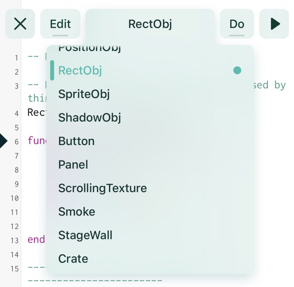
The other use case was when you have so many menu items you can’t fit them on the screen. Such as using the menu to navigate your project in Codea.
Making the menus scrollable was what I needed. So I added the ability to specify a maximum height. Content exceeding the height led to a scroll view implementation.
This still had to work with both the tap and drag styles of interaction.
For tap it was easy. Open the menu then drag to slide the scroll view. It did introduce a slight delay on tapping menu items in order to distinguish whether the user intended a tap or a drag. I also wanted to be able to convert to the drag style interaction within a scroll view. So tapping for slightly longer, then dragging, will drag-select through the menu contents.
When dragging the menu I needed the entire interaction to take place in a single gesture. You open the menu, drag to the item (even if it’s initially off-view) and release. For this, I needed to check if the drag position was sitting at the bottom or top edge and use a timer to adjust the scroll position in the direction the user was intending so that they could reach their menu item.
The Cut-off
Of course, when you introduce scrolling into menus you have to deal with what happens at the edge of your scroll view. You could simply cut it off.
I wanted something more graceful.
I ended up using a CAGradientLayer as a layer mask at the top of the scroll view to ensure that the content faded instead of cutting off.
Readability
Codea seamlessly switches between using a menu for the tab bar in compact mode, or a real tab bar in regular mode.
When using the full-size tab bar with the light colour theme, I found the translucency on the menu was making text hard to read. Because selected tabs were pure white, and unselected tabs were quite dark. But the text on menu items was fixed.
I tried UIVibrancyEffect on the text and icons. That just made everything less readable.
What I ended up doing was choosing a light or dark tint for the menu title text and buttons based on the area of overlap with the underlying view, and the darkness of that view.
Basically, I computed the area of intersection between the menu item’s view and the underlying view. If the underlying view was dark I used the light tint colour, and if it was light I used the dark tint colour.
No one notices this, but I keep playing with it. It makes me happy.
Shortcut Layout
When I first implemented shortcut key rendering on menu items it looked off. And on checking macOS, I saw why.
macOS uses a column layout for shortcut keys. So all your ⌘ symbols line up. All your letters line up. It looks great.
What I needed for my shortcut menu items was a horizontal layout containing the modifiers and keys in equal(ish)-width boxes. But not all shortcuts are equal-width — we have one in Shade, “Space” to create a node.
I used a UIStackView on the right edge of shortcut menu items to render the key combinations. This works pretty well.
Advanced Interactions
There’s a few cool features that round-out the menu system, especially when used to navigate code files.
You can trigger standard iOS gestures on menu items in the tab list for renaming and deletion. These are hidden and will likely also be made available in the “Edit” menu, but it’s good to have them as a gestural shortcut.
You can also re-order your tabs using drag-and-drop directly in the menu. The awesome thing about iOS drag-and-drop is that it automatically scrolls underlying UIScrollViews when you drag something to the edge of a scroll view. So I didn’t need to re-implement the edge based scrolling logic, iOS gave it to me for free.
This also means you can drag your code out to another app as a plain text .lua file. And if you want to be tricky, you can also drag plain text straight into the menu to insert it as a tab in Codea. Because why not, right? We’ve come this far.
Thanks for reading. Let me know what you think on Mastodon.
The Code
Oh, and I’ve put the code on Github