Codea is our iPad app for creative coding. I’ve been developing a universal version for some time.
It’s hard to take a complicated, eight-year-old iPad coding environment and bring it to iPhone. There’s so many damn features that need to work in so many damn configurations.
Autolayout takes care of many of these issues (thanks, SnapKit). But it doesn’t take care of the most important: design. I’ve been stuck on the design for a universal version of Codea’s code editor for over a year. It might even be two.
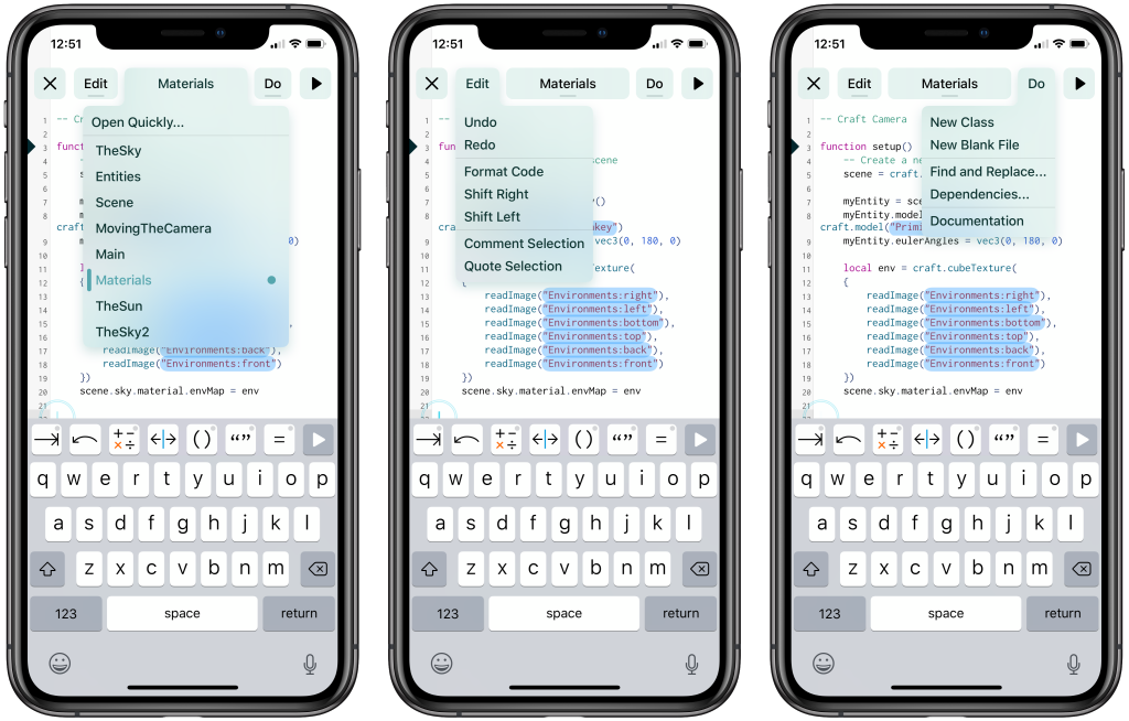
I realised six months ago as I was using my Mac, using the menus, that I need these things — menus — in Codea. I was trying to solve a problem that has been solved for decades.
So I set out to make the best menus I could make for iOS.
For simple apps, menus aren’t necessary, and that’s great.
But Codea isn’t a simple app and there’s nothing I can do about that.
What it can be is discoverable. Compared to all the options I considered, menus are exactly that, discoverable. You pull down a list of named features complete with shortcut keys (if a keyboard is attached). Then you activate that feature by tapping on it, or by dragging your finger and releasing.
Hamburger menus, side-drawers, whatever you want to call them, are a conventional way to bury additional and often unrelated functionality into an app. But they are much heavier than the good old-fashioned menu bar. They often pull out a whole modal side-thingy, maybe they slide all your content to the right. It’s a context switch for your brain.
Menus categorise items under common, plain-text headings, and they appear and disappear without fanfare.
I wanted menus that looked beautiful, looked like iOS, and felt great.
Building the iOS Menu, Visually
This part gets technical.
I knew what I wanted from the beginning: a rounded, translucent menu with a drop shadow. It had to have those things.
Translucency on iOS is easy. You use UIVisualEffectView with a light or dark blur effect and whatever is behind your view gets nice and blurry.
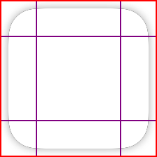
Rounding the menu was harder. You can use a layer’s cornerRadius property to round the corners, but I wanted the rounded part of the menu to pop out from the menu button itself. Like this.
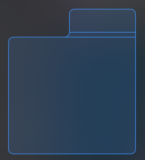
(Note: I just QuickLooked the UIBezierPath in the Xcode debugger for this image. Seriously, how cool is QuickLook?)
So that’s not too hard, you can generate your own UIBezierPath, create a CAShapeLayer with it then assign that as the layer.mask on the UIVisualEffectView. That will get us the rounding.
But what if your view casts a drop shadow?
Yeah, you get a nice blurred shadow. Gross.
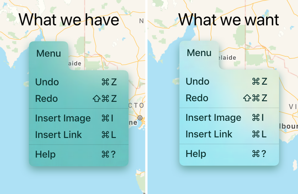
Right: the appearance we want
I was sure I had seen this problem solved before. By Apple in one of their apps. I remembered that the iOS Maps app has a cool draggable panel which uses a visual effect view and a drop shadow.
Surely if Apple solved this, we can just do what they did?
Brian Coyner looked into Apple’s implementation in Maps and found… a 9-patch image.
A baked shadow image for the edges with a transparent middle. There’s a great piece on how to create this effect. But this wasn’t going to work for my menu.
My menus have more complex rounded shapes, and the relative sizes of those shapes changes based on text length. And if I wanted to vary things like the corner radius, shadow radius, or shadow offset I didn’t want to have to re-export static images.
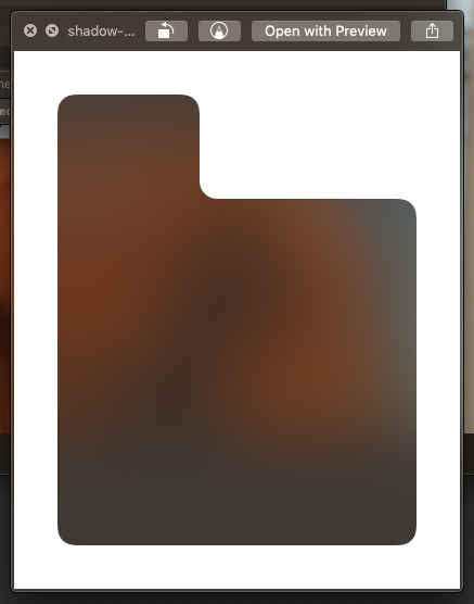
So what do we do? We create an inverted shadow mask image and apply it as a layer mask to the rasterised drop shadow image.
Basically, we create a solid image that has a transparent region in the middle in the shape of the menu bezier path.
This turned out to be really easy to do, though it took a bit of experimenting. Here’s the key:
let imageRenderer = UIGraphicsImageRenderer(size: shadowView.bounds.size)

let shadowMask = imageRenderer.image {
    context in

    UIColor.white.setFill()
    context.fill(shadowView.bounds)
    path.fill(with: .clear, alpha: 1.0)
}
We create a shadow mask image by filling an image with white, then filling our bezier path (see above) with a clear colour. This gives us an image that looks like this.
Then we apply that as a layer mask to the rasterised drop shadow, and we’ve done it: Menus with arbitrary shapes, drop shadows, and blurred backgrounds.
The video above is from our new app, Shade. Which is in public beta right now. Codea 3.0 and Shade 1.0 will both make use of these menus to some extent.
There are a ton of details not covered here. Let me know on mastodon if you want to see a follow up about them.
You can now find part two here, in Detailing the iOS Menu