Codea 3.3 arrives today with brand new autocomplete. In case you’re new here, Codea is a creative coding app for iOS. You can learn more here
tl;dr you can skip straight to the write-up on what’s new in autocomplete
Old Design
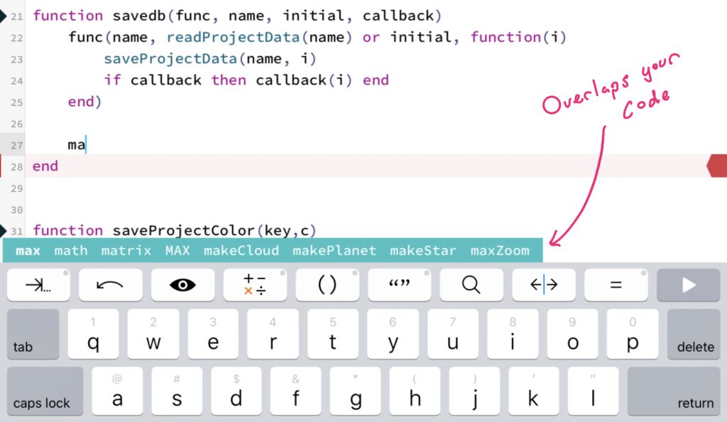
This is what we’re replacing. The teal coloured bar pops up above the keyboard as you type, with the downside that it overlaps your code. Codea would compensate for this by scrolling a little more to ensure the text insertion caret was always visible above the autocomplete bar

A few weeks ago a user reported an innocent sounding bug on the forums which ended up on to my todo list:
- Placing cursor near top of keyboard is jumpy
Have you ever had to fix a tiny bug, and in doing so you realise there’s no solution except to rip everything apart and re-think the way the feature works? That was this kind of bug
What was happening here was that placing the text insertion point near the top of the keyboard caused everything to scroll up a bit
I realised that this was happening because many years ago I had fixed an earlier bug — namely that the autocomplete bar could overlap where you were typing. To fix this I increased the amount the code editor scrolled to ensure that the text insertion caret could never be overlapped by the autocomplete bar
There was no good way to fix the scrolling issue while having autocomplete live above the keyboard. So I moved the autocomplete UI, and in doing so implemented many of the features I’d always wanted
New Design
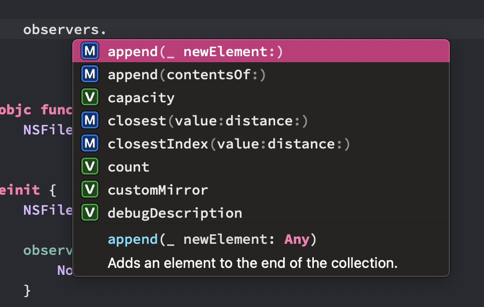
The first thing to do was move the bar somewhere else. Desktop editors use a popup window which appears near the insertion point

This is good when you use a keyboard and mouse, but I wanted to make Codea feel great when you’re coding on the couch, in portrait mode, with your thumbs on the software keyboard. (Codea also works great with the Magic Keyboard and trackpad, but that’s a bonus)
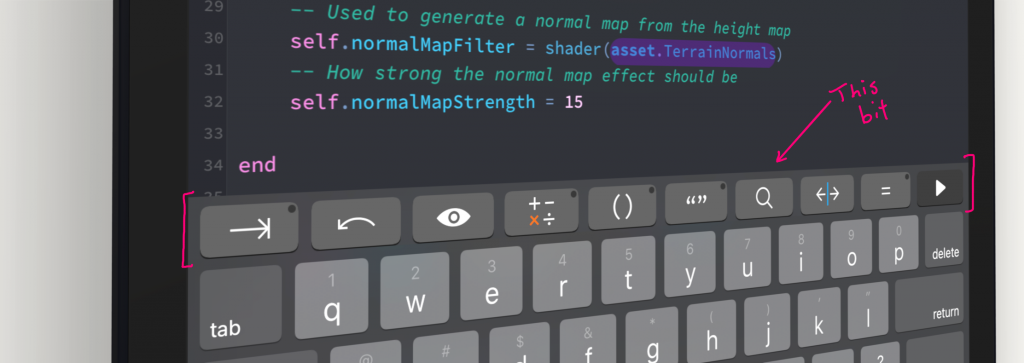
I kept the horizontal design and could only think of one place to move autocomplete — into the keyboard accessory buttons. It would replace them, temporarily, when Codea needed to show completions

Even though the bar was moving here I chose to keep the play button always visible. I also added a way to dismiss autocomplete so that people could see the keyboard buttons if necessary
I used this opportunity to add things I had been wanting to add for years, as Codea’s original autocomplete code was now nearly ten years old. Ten years!
The first thing I wanted was scrolling for long lists of completions. The old autocomplete UI would show completions off the screen, and the only way to get to them was to keep typing
In order to add scrolling and keep the play button visible I had to figure out what happened when the completions passed underneath the play button. I used a CALayer mask to cut them off with a gradient so they would fade out as they passed underneath
Now for the rest of the features I wanted to add
Features
I spent a huge amount of time adding everything I’ve always wanted to this new version of autocomplete, here’s what’s new
It has syntax highlighting

And asset icons — This is really cool. Codea has a statically typed asset API which monitors the file system. So when autocompleting assets, you get icons indicating file types and directory types alongside the autocomplete suggestions

Here you can see that in my project — by typing asset. — I have some Lua files, a background image, and some data
Previews too — Taking it further, when you long press an asset completion Codea gives you an instant preview of that file. You can quickly check what a sprite looks like, or even listen to a sound file or audio track
Instant documentation — Notice some of the completions are underlined? Long press these to instantly see their documentation
Keyboard support — I said earlier I want Codea to work great with the software keyboard, but that doesn’t exclude great hardware keyboard support. You can navigate through the completion list with the left and right arrow keys, and use tab or return to select a completion
It’s more accessible — the new autocomplete bar scales with the editor’s font size
Goodbye Old Autocomplete
The old autocomplete code lasted ten years. Now it’s gone and there’s a lot of complexity and subtlety in its replacement, but I hope the trade-off is worth it
Liked this? Let me know on Mastodon
About Codea
Codea is a creative coding app for iOS by Simeon Saens and John Millard. We’ve been working on it for ten years. I maintain the front-end and code editor features, while John works hard on the rendering system. We also make Shade