Shade is finally available for pre-order on the App Store. It’s free with a 14-day trial, so if you want to see some of these things in action go pre-order it for when it comes out on March 15
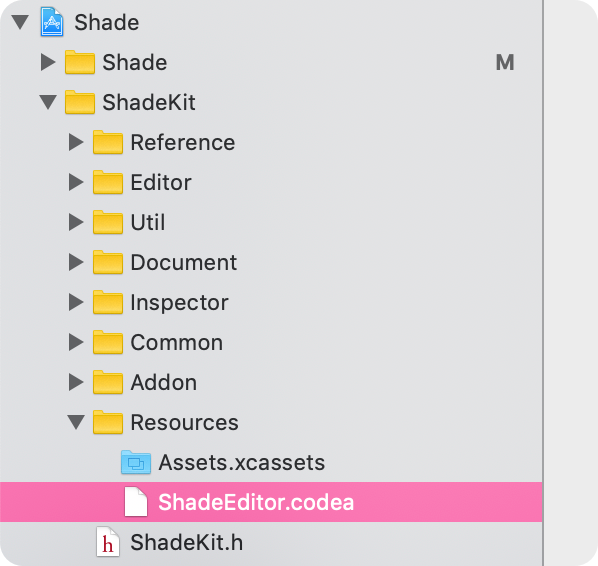
You might be surprised to learn that a considerable part of Shade was actually coded on an iPad in Codea
Let’s look at some of the details that went into making a UIKit interface that lives on top of a Codea interface. I’m going to pick some of my favourite UI features of Shade to tell you about
Made with Codea

A lot of Shade was made with Codea. In Lua. On an iPad (at times) and on a MacBook (at other times). Shade’s UI is beautiful and I’m very proud of it. But creating its bespoke graph UI — integrating live node previews, rendering gradient-filled bezier curves, is not the most straightforward thing using UIKit
So we didn’t
I designed Shade’s UI in Sketch, and John felt confident he could pull it off in Codea. I was hesitant at first and even prototyped some of the proposed UI in UIKit, but in the end I’m very glad we went down the path of building UI in Codea. It is just so fast for getting things on the screen and there’s no enforced way of doing things. You get a draw loop and access to graphical tools and shaders. Sometimes, that sort of freedom is a wonderful thing to have
This allowed us do things like use a custom shader for the bezier curves (originally made by a user on the Codea forums), integrate live shader previews on any node, and build an entire resizeable 3D model viewer with physically-based rendering, transform gizmos and AR previews right on the graph

The other benefit was iteration speed. Codea runs instantly. Swift on the other hand… does not. Even Swift Playgrounds sits for quite a few seconds before it evaluates your code
Making Shade’s UI in Codea also led me to improve Codea for everyone. I ended up shipping four or five Codea updates during Shade’s development which introduced small but important changes to the runtime such as access to the iOS system font (the system font is actually two fonts which select based on point size), access to safe areas, and deprecating Codea’s orientation-based API in favour of size classes and size changes
Expressions
One cool feature of great macOS apps is typing mathematical expressions into input fields. Like, want to halve the size of your artboard in Sketch? Just type /2 on the end of the dimensions
I needed this for Shade and when I found Expression by Nick Lockwood — I jumped on it
Here’s an example of it working
The UIKit Layer
Despite how happy I was with the graph UI in Codea, I knew the top layer had to be UIKit. I needed great support for system-level features like Dynamic Type, drag-and-drop, and native text editing
So while John worked on the graph editor I got to work building the infrastructure and implementing the design of the top level UI where you would adjust your parameters
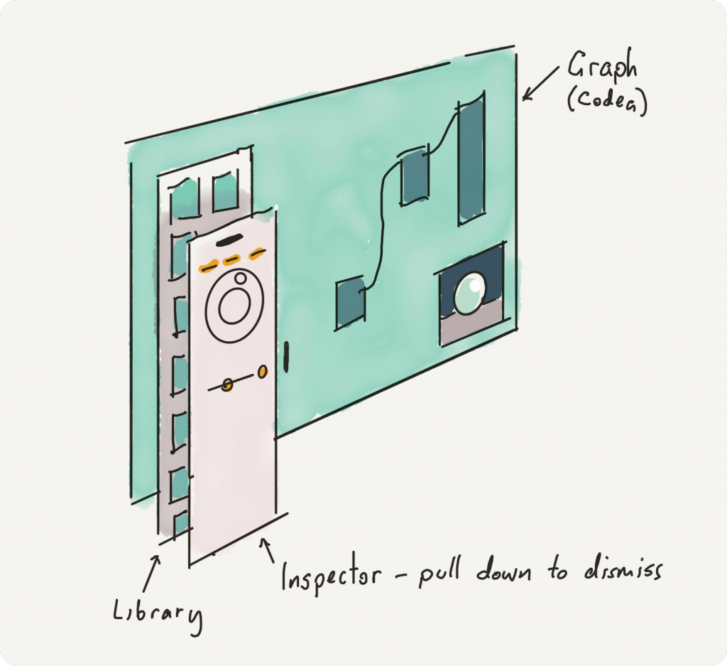
I wanted to use visual effect views. Because I wanted the colourful graph to be blurred beneath the node inspector, but I had a problem because the design called for two elements: a library where all your nodes come from, and an inspector which would slide above the library to allow you to edit an individual node’s properties. Both of these would display over the blurred graph, but they also needed to appear like they were overlapping panels

This slide-over effect meant that I might have two visual effect views overlapping, and that’s not good. It would darken and diminish the effect
I turned to layer masking
When the inspector slides up, it masks the view controller underneath and they share a backing visual effect view
And when you scroll content off the inspector it uses a gradient to mask that content into the top fold of the inspector panel, so there’s no nasty cut off
Internal Plumbing
An important part of the UI, even though you don’t see it, is the feeling that it’s solid. And because of how complex Shade is I wanted to make sure stuff didn’t go out of sync
Internally the way Shade pipes data around is made reliable thanks to Swift and value types. The value types are all Codable and because we were dealing with Lua (and Lua just don’t care about types) I made sure to treat any bad data with a crash or an extremely obvious error. My thinking was: we were going to use Swift’s robust type system to force ourselves to be disciplined on the Lua side
It worked. It’s even possible to pop open two inspectors looking at the same property, slide one piece of UI — whether it’s a colour picker, slider, or a piece of text — and it changes everwhere, including the live 3D preview, node graph, and all the bits of UIKit
Innovative Graph Features
Finally, I’d like to mention two contributions Shade brings to the world of node-based editing that make it more accessible and intuitive
Foundational to our design was the idea that you should be able to connect anything to anything. Shade should never stop you. So when you grab a colour and try to plug it into a number, what happens? And what happens when you grab a value and try to connect it to an input with an existing value? In these cases we have two features
Auto swizzling, in which connecting values of differing dimensions brings in this piece of UI called the swizzle pip. Tapping on it gives you a glimpse inside the connection and how it’s converting it, from there you can even re-wire it (though in most cases you don’t have to, we pick sensible defaults)
And connection stacking. One of my annoyances with graph editors is the abundance of combiner and arithmetic nodes. Adds and multiplies and so on, they clutter up the graph with very trivial operations. In Shade these sorts of basic combinations just fall out of connecting a bunch of things into one input. The connections start to stack, like layers in Photoshop. Then you can tap on the operator icon to cycle through how that input is blended with the underlying values in the list
I have some plans for this, like expanding the operators to include Photoshop blend modes in addition to basic arithmetic
More to Come
Shade is only at 1.0 and it’s quite a fun and powerful tool. We hope that it finds its audience so we can make it grow. It has also made me far more likely to consider doing future projects in Codea, and adding more features into Codea to turn it into a tool for producing apps that just don’t fit the mould laid out by UIKit
If you liked this, let me know on Mastodon